
Split’s goal is to power the world’s product decisions, so we are always looking for new ways to enable our customers to be more data-driven. We believe in the power of metrics and strive to make sure our users have a holistic view of their experiments’ impact. Split’s existing metrics impact page allows you to make powerful product decisions and understand the effect on your business goals.
With today’s feature release, Split allows you to dive into your experimental results even further. With our new metric details and trends view, Split users can access the metric impact trends, the metric dispersion, and the sample population used for the metric value. This release comes from speaking with our customers and learning how they can gain an even greater benefit from our metrics impact view, and achieve a deeper understanding of the metrics they care about. Our metrics impact page informs users if their experiments were a success by highlighting whether or not they reached statistical significance. With this new view, you get additional insight to understand the why behind your metric’s impact. This view also helps you diagnose any problems with your experiment.
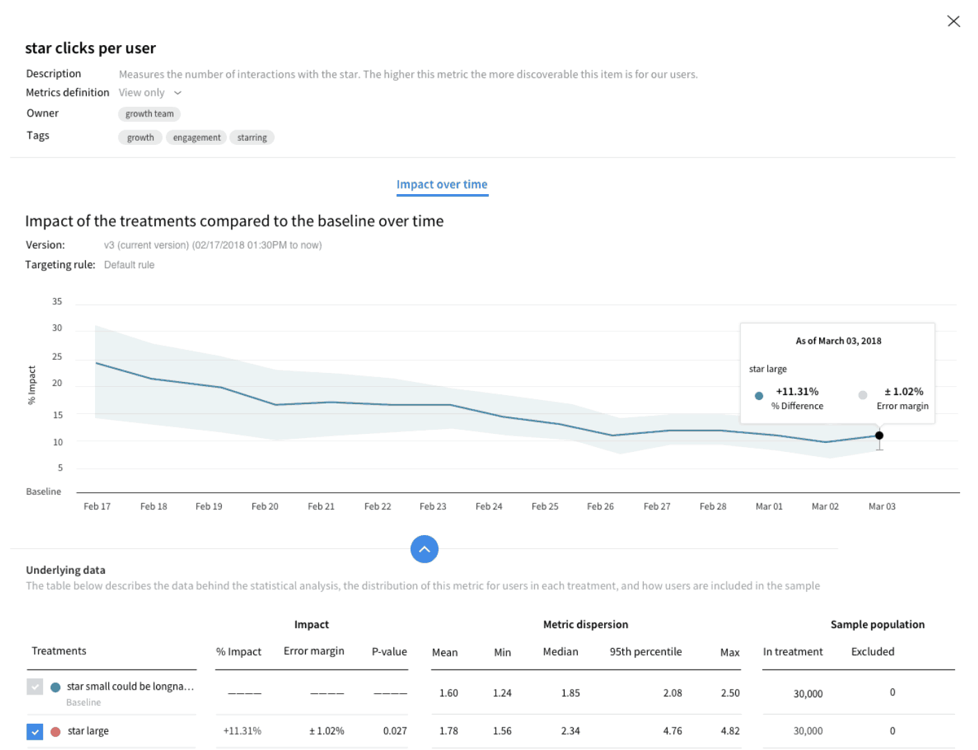
Trend Overtime
When we spoke to our customers, they wanted to better understand how the impact on their metrics had changed and how volatile that had been over the course of an experiment. With the trend over time chart, you can easily visualize the difference in the impact, as well as how the error margin has changed time. The line chart is interactive, so you can access the values from any previous calculation. This is helpful if an external event occurred that you believe may have affected your experimental results. You can easily go back and see the data for that point in time.
Metrics Dispersion
In this section, you can see your metric value’s dispersion, including the minimum, maximum, median, and 95th percentile, when relevant. This section also includes the absolute total of the metric value. For example, if you are measuring the count of purchases per user, you can see the actual count of purchases in each treatment (as well as the uplift between the treatments). The metric dispersion allows you to measure the spread of your data or, in other words, the variability in your sample. A measure of the metric dispersion gives us an idea of how well the mean, for example, represents the data. If the metric dispersion in the data set is large, the mean is not as representative of the data and vice versa.
Sample Population
It is also important to understand how attribution in your experiment has impacted the number of users excluded from the analysis. Attribution is the process of mapping user-generated events to the experiments and treatments to which they were exposed and is a cornerstone of running accurate experiments. As a reminder, Split excludes a user who has flipped between treatments and a targeting rule more than once. This is to maintain clean data and not cross-contaminate experimental results. In the metric details and trend view we provide the number of users in your treatment, the number of users excluded from either flipping treatments or metric filtering, and the number of users resulting in the sample population. For example, this will help identify any setup issues or errors in your experiment if you observe that a majority of users are being excluded from your analysis.
You can find out more about how to choose the right experiment metrics for your organization in this blog, as well as the other types of metric functionality we support.
Get Split Certified
Split Arcade includes product explainer videos, clickable product tutorials, manipulatable code examples, and interactive challenges.
Switch It On With Split
The Split Feature Data Platform™ gives you the confidence to move fast without breaking things. Set up feature flags and safely deploy to production, controlling who sees which features and when. Connect every flag to contextual data, so you can know if your features are making things better or worse and act without hesitation. Effortlessly conduct feature experiments like A/B tests without slowing down. Whether you’re looking to increase your releases, to decrease your MTTR, or to ignite your dev team without burning them out–Split is both a feature management platform and partnership to revolutionize the way the work gets done. Switch on a free account today, schedule a demo, or contact us for further questions.