
What Is Dimensional Analysis?
Data is one of the most valuable assets of any business. With feature flagging and experimentation, data is indispensable in measuring a new feature’s impact on key performance and business metrics.
Split’s Dimensional Analysis is an effective way to add color to your data. Find the root cause of surprising outcomes and learn from your experiments. If what you discover is disappointing, with dimensional analysis, you can understand why. Dimensional Analysis enables companies to utilize their event property data across all sources. You can create a set of dimensions that can be used to slice experimentation data and gain additional context. Once configured, Split will periodically review event data streams and identify any unique property values for those dimensions. It will then calculate your metrics based on attributed activity for these unique event property values.
How do you make the most of Split’s Dimensional Analysis? Follow our guide to help.
Throughout the guide, we’ll cover dimensional analysis best practices as described through a few practical examples.
- How to organize your event data after importing it to Split
- How to create relevant and intentional dimensions for your experiments
- How to plan and optimize your next experiment using dimensional analysis
First Example: One-Click Purchase
Imagine that you sell goods or services on the Internet. Here’s a quick look at a common experiment and how to leverage dimensional analysis for your results.
Hypothesis: There’s a Difficult Transition From Exploration to Basket
Let’s say your funnel from selection to “add-to-basket” is good, but there are a lot of abandoned baskets. Feedback from user research is that it’s difficult to find the basket in the corner of the screen and pay. Analytics tells you most baskets have a single item—and you are not offering any discount for larger orders. In response, you want to offer the option to pay with one click.
What To Test: One-Click Purchase Can Close the Gap
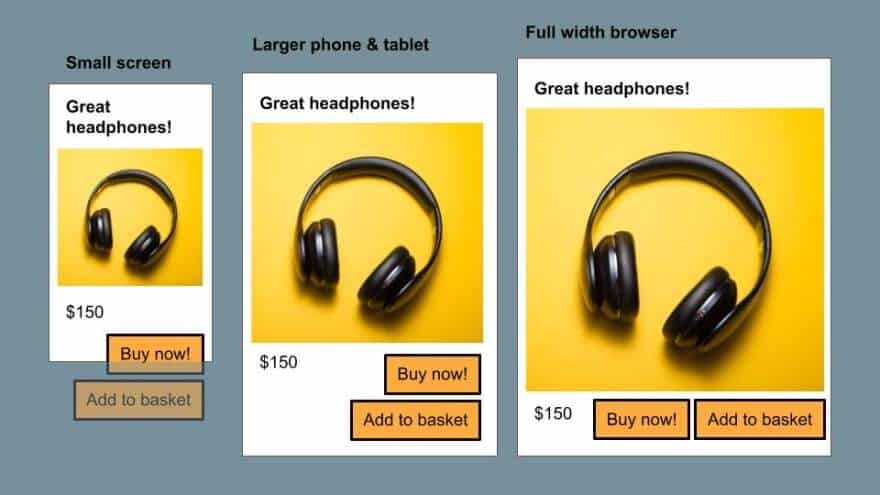
In this case, you might be worried that one-click purchases will lower the average basket size. More importantly, you’re concerned that the buttons are not equally visible on different platforms. So you test it. You want to A/B test showing a one-click purchase button for all users. And, you want to see results for people with small or big screens, different platforms, new vs. established users, and so on. That experiment can be triggered by seeing any product listed, as the “buy now” button appears next to the existing “add to basket”.
The goal is to measure an increase in conversion: purchases per visit. We recommend having cancellations per order within a day as a guardrail metric to ensure there aren’t too many misclicks.
Picking Relevant Dimensions
The best way to create dimensions for your test is by including the relevant information as a property value. This occurs in the event property that marks the conversion for a given metric (e.g. adding a product listing to your basket). Relevant parameters could be the platform, the browser, the screen size, the log-in status, error code, error message, payment type, and more.
The Platform
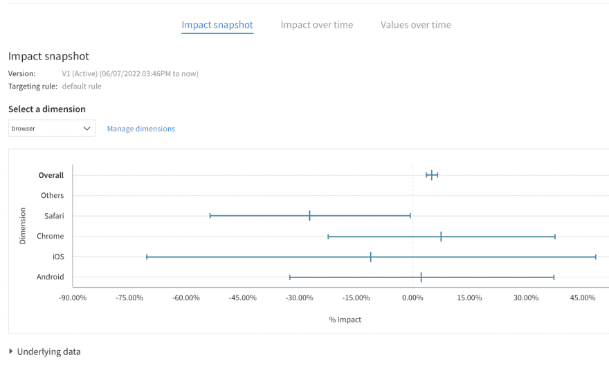
Most customers run Android and iOS in different environments. If your architecture relies on a shared back-end, and you test there, you can use that distinction as a key dimension. If you also have a web store, you might want to look at browsers (like Chrome and Safari). We recommend separating known mobile and desktop browsers. There will be other platforms like tablets: you can pool them into a fifth category, include them in others, or ignore them.
Browsers
Browser rendering engines will affect how your website looks. Having a dimension per browser is a great complement to the platform. There are currently four popular options: Chrome, Firefox, Safari, Edge, and a fifth for either Brave or all other browsers.
PRO TIP: All additional property values that weren’t specified in the dimension definition will be bucketed as “Other”.
Having results detailed for every single browser version won’t help much. First, with only a few observations for the less used ones, the results will have very wide confidence intervals. More importantly, detailed results won’t lead to decisions. You can’t roll out based on categorical results alone: there’s too high a risk of false positives with so many results. You are better off grouping browsers into large consistent groups matching the most common browser on your site.
Screen Size
This would be related but different from the platform. Again, for your results to be significant, you want to have three to five categories. We recommend that you pool sizes into buckets relevant to your responsive design, before sending them as a parameter for page-loading events.
Log-in Status
Whether the user is an established customer is key to how they understand your service. Typically, it’s easier for your front-end service to know their log-in status. You can use that as a proxy. We’ll look at how to handle actual customer experience soon.
Results and Interpretation
Dimensions like these will be visible in the Impact Snapshot. They help you understand whether offering a one-click purchase works best for all users or whether there are users that need more support.
Note: The Impact Snapshot represents the cumulative impact per property value and is based on all the data we have received up until the last calculation update. You can get more information about the data by hovering over the lines such as the impact interval.
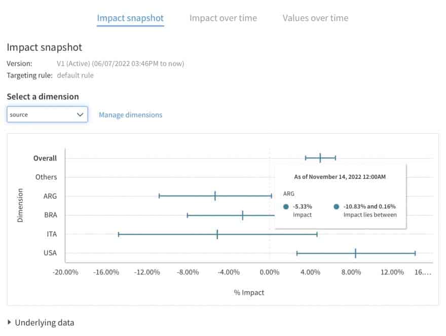
For example, if users with a very small screen don’t buy more, it could be because they can’t see both buttons. As a result, “buy now” feels too imperative without the option of a basket.
Categorical results alone help to point at a likely issue or a possible explanation. You should not use those to decide on separate rollouts for each category. For that, you need to confirm your interpretation by interviewing relevant users and trying another A/B test. Your goal is to confirm the impact of your best implementation. In this case, it would be to make sure both buttons appear on a screen of any size.
Second Example: Implementing Apple Pay
Imagine that the first experiment is working fine (notably on a larger screen and with a desktop browser). But your users still struggle to interact on mobile. Let’s now look at a more targeted experiment and what it means for the dimensions that you want to pick.
Issue: Payment Information Is Tedious to Enter
Let’s say your payment process involves typing a credit card number most of the time. Android and Chrome have an auto-filling option and it seems to work fine. On the other hand, iOS and Safari users are struggling.
Hypothesis To Test: Apple Pay Is Convenient When Available
Let’s assume you want to test Apple Pay to improve conversion. That test would be only relevant for a subset of users. We don’t recommend testing for users who aren’t impacted by the change. It restricts the number of participants involved, and excluding Android users helps avoid dilution. Without dilution, test results are clearer and faster.
Dimensions
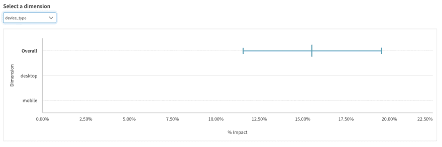
For this test, we can reuse dimensions, platforms, and browsers from the previous experiment. Some dimensions are not relevant, like screen size.
The best metric, in this case, is likely the conversion from wanting to buy (“buy now” or “pay for this basket”) to a successful transaction. You can have fraud payments, cancellations, and returns per order as control metrics. What about dimensions? Let’s take a look:
Platform and Browser
Keep the distinction between platforms: IOS app user, mobile browser, and Safari browser.
There shouldn’t be any Android users, or browsers other than Safari because Apple Pay isn’t supported on those. This means that the browser dimension won’t be very relevant.
Screen Size
Screen size is likely not important, so you can forgo that dimension for the test. If you do not send the screen size as a property of either the assignment call or the conversion event, the dimension will still appear. However, it will appear with the overall result and without any breakdown data.
PRO TIP: Consider this easy way to check whether a dimension is valuable. Imagine you are seeing results that are different and significant within one category, what would you do? Would you rather assume it’s a fluke, or do you have a relevant interpretation that you can justify without the test result? If you’d rather ignore it, don’t include the dimension: it will confuse you more often than not.
Log-In
Log-in to your service may not be relevant for this test. It does matter whether users were logged-in to their iCloud account, but you might not have that information before users try to pay. If you don’t have access to the report, you won’t be able to make decisions based on it. As a result, you won’t be able to run categorical roll-outs anyway.
That leaves you with one dimension: Platform. Some tests don’t need more.
Results
If the above experiment works, congratulations! That should have increased your revenue enough to justify more exploration. That means more hypotheses, more experiments, and more categories.
New Possible Dimension: Payment Type
Once this is done, you might want to use Payment type as a new dimension for future experiments. You can use for example:
- New credit card
- Stored credit card
- Google Pay / Apple Pay
- Vouchers
This allows you to make sure to understand whether improvements in the payment flow work better for certain payment modes.
Third Example: New User Experience, Engagement Level, and a Feature Store
The previous examples should cover a lot of common experiments. However, there are cases where you might want to go further. Let’s explore how you can leverage your understanding of your users to dig deeper and have more insightful results with custom dimensions.
Hypothesis: New Users Need Better Context
Let’s say you notice that new users are less likely to trust your service and convert. Forcing one-click purchases on them, no matter how seamless the experience, isn’t going to ease their concern. What they want is more details, social proof, etc.
To offer them proof, you can build a New User eXperience (NUX): it’s a hands-on introduction to your service. Video games do this quite often, particularly casual ones. It’s great, but it can feel cumbersome, especially for established users.
Issue: Categories Not Available When Sending Event
So, who are your established users? Your analysts can pool users into the following groups:
- New and not-logged-in users
- Users who have only bought once recently
- Disengaged users that come back
- Active users
- Very engaged users
These are important categories to understand your business. Decide who would buy more if given a promotion. Until now, these were exclusively used outside of your live production service: for business reporting, strategy, or to send promo emails in batches.
Architectural Solution: Feature Store
If you want to show something more sophisticated to new users vs. active ones, you want to make that information available to relevant services. If it’s available in the service that handles the experiment, you can send it to Split using an event property. If it’s not, you can export the information in bulk via our API. No matter how you send event data, you can view possible dimensions and property values via a dropdown menu when creating dimensions in the Admin panel.
What if your analysts have worked on a typology? Typically, it would be in their analytical stack, often called a data lake. What if the information is not available in your live e-commerce service? Then you can’t send properties with events from within your app. However, you can import that information from your analytics services into Split. That will allow you to have test results broken down by dimensions that reference those properties.
PRO TIP: When importing data into Split, make sure you’re properly sending in events with event property values.
In addition to results, you want to use that information to differentiate what customers see. You will need to send that information from your own analytics data lake back into your live production service. One approach for that is a Feature store: a (micro-)service meant to make analytical aggregates and inferences available to other (micro-)services. A feature store is often used for machine learning but can help improve your dimensional analysis. Typically, it’s an API that, given a user identification, can send back information, like the total amount of recent purchases or probability of churn.
In our case, you could get the user engagement classification that we mentioned before: new or logged-off, recent, re-activated, active, or engaged. That allows your service to send that information with the initial impression and getTreatment call — even if it was not information available to your service before.
Engagement is a better dimension than log-in/log-out. We recommend that you make sure that all the events that you track with Split send that information instead. Once you have done that, you can get rid of the now obsolete log-in status to avoid confusion. Instead, you can use a more relevant dimension of Engagement level.
Summary
Think of Relevant Categories
If you want to build dimensions that fit your business, as well as your user types, don’t just use categories that everyone else is using. Think critically. If you see significantly different results along that dimension, what would your interpretation and decision be? Would there be a better category that helps to understand?
Target Test if Only One Category Matters
In some cases, you may want to test the impact on a subset of users. It sounds tempting to use categorical results for that. However, if the other users won’t see a difference, you shouldn’t expect contamination. In those cases, run a test targeted at the relevant population: your test results will be clearer.
Experimentation Requires Teamwork
It’s a good idea to discuss with your users to understand their diversity or ask your user-experience researcher (UXR) to structure their observations. Your analytics team should be able to represent new concepts. More importantly, make sure your data engineering team makes inferences available where your test events are sent.
Iterate, It’s Worth It
Finally, this advice offers some directions to explore. But you will have surprises along the way, and find more relevant dimensions to look at. Like every aspect of experimentation, iteration and learning are key.
Get Split Certified
Split Arcade includes product explainer videos, clickable product tutorials, manipulatable code examples, and interactive challenges.
Switch It On With Split
The Split Feature Data Platform™ gives you the confidence to move fast without breaking things. Set up feature flags and safely deploy to production, controlling who sees which features and when. Connect every flag to contextual data, so you can know if your features are making things better or worse and act without hesitation. Effortlessly conduct feature experiments like A/B tests without slowing down. Whether you’re looking to increase your releases, to decrease your MTTR, or to ignite your dev team without burning them out–Split is both a feature management platform and partnership to revolutionize the way the work gets done. Switch on a free account today, schedule a demo, or contact us for further questions.